Difference between revisions of "Column Chart/pt-br"
(Created page with "Um gráfico de Colunas representa os dados como uma série de colunas verticais cuja altura é determinada pelos valores dos dados") |
|||
| Line 1: | Line 1: | ||
Um gráfico de Colunas representa os dados como uma série de colunas verticais cuja altura é determinada pelos valores dos dados | Um gráfico de Colunas representa os dados como uma série de colunas verticais cuja altura é determinada pelos valores dos dados | ||
| − | + | O Gráfico de Colunas precisa de pelo menos uma coluna de [[Date/pt-br|Data]] ou [[Text/pt-br|Texto]] que será usada para agrupar os dados e colunas de [[Value/pt-br|valores]] que serão mostradas como colunas no gráfico. | |
For other chart options, see [[Objects]]. It is also possible to create combined charts by changing the [[Series Type]] property of the [[Value]] columns. | For other chart options, see [[Objects]]. It is also possible to create combined charts by changing the [[Series Type]] property of the [[Value]] columns. | ||
Revision as of 17:38, 3 April 2014
Um gráfico de Colunas representa os dados como uma série de colunas verticais cuja altura é determinada pelos valores dos dados
O Gráfico de Colunas precisa de pelo menos uma coluna de Data ou Texto que será usada para agrupar os dados e colunas de valores que serão mostradas como colunas no gráfico.
For other chart options, see Objects. It is also possible to create combined charts by changing the Series Type property of the Value columns.
Examples
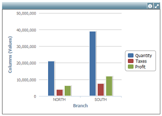
In the above example the chart displays the Quantity, Taxes and Profit by company Branch.
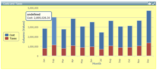
In this example the chart displays the Stacked values of Taxes and Cost by Month using different Layout Properties.
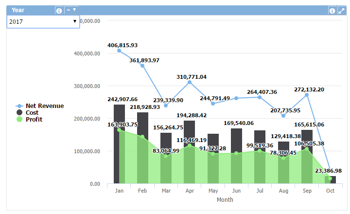
This example shows the 'Cost', 'Profit' and 'Net Revenue' values using different Series Type (column, area and line).
Data Properties
- Advanced row filter
- Column order
- Decimal (Y axis)
- Filters
- Row limit
- Rows sort
- Stacking
- Thousand sep. (Y axis)
- Total row
Title Bar Properties
Layout Properties
- Background color
- Border color
- Font size
- Hide labels
- Labels rotation
- Legend position
- Object dimensions
- Object positions
Object Columns Properties