Difference between revisions of "Chart Axes"
| Line 2: | Line 2: | ||
<translate> | <translate> | ||
<div class="index-right">__TOC__</div> | <div class="index-right">__TOC__</div> | ||
| − | + | == Axes Options == | |
| − | |||
| − | |||
| − | |||
| − | == Category Axis == | + | === Category Axis === |
[[File:ChartAxes Category.png]] | [[File:ChartAxes Category.png]] | ||
| Line 17: | Line 14: | ||
* [[Hide Category]] | * [[Hide Category]] | ||
| − | == Value Axes == | + | === Value Axes === |
On the Value Axes there are some graphics that support only one value axis ([[#Simple Value Axis]]) and other that support one ore more value axis ([[#Multiple Value Axis]]) | On the Value Axes there are some graphics that support only one value axis ([[#Simple Value Axis]]) and other that support one ore more value axis ([[#Multiple Value Axis]]) | ||
| − | === Simple Value Axis === | + | ==== Simple Value Axis ==== |
Graphics that support only one value axis | Graphics that support only one value axis | ||
| Line 33: | Line 30: | ||
* [[Minimum Axis Value]] | * [[Minimum Axis Value]] | ||
| − | === Multiple Value Axis === | + | ==== Multiple Value Axis ==== |
We support graphics that can have one ore more Value Axes, so you can create complex graphics, as you can see bellow. | We support graphics that can have one ore more Value Axes, so you can create complex graphics, as you can see bellow. | ||
Revision as of 22:20, 4 October 2022
Axes Options
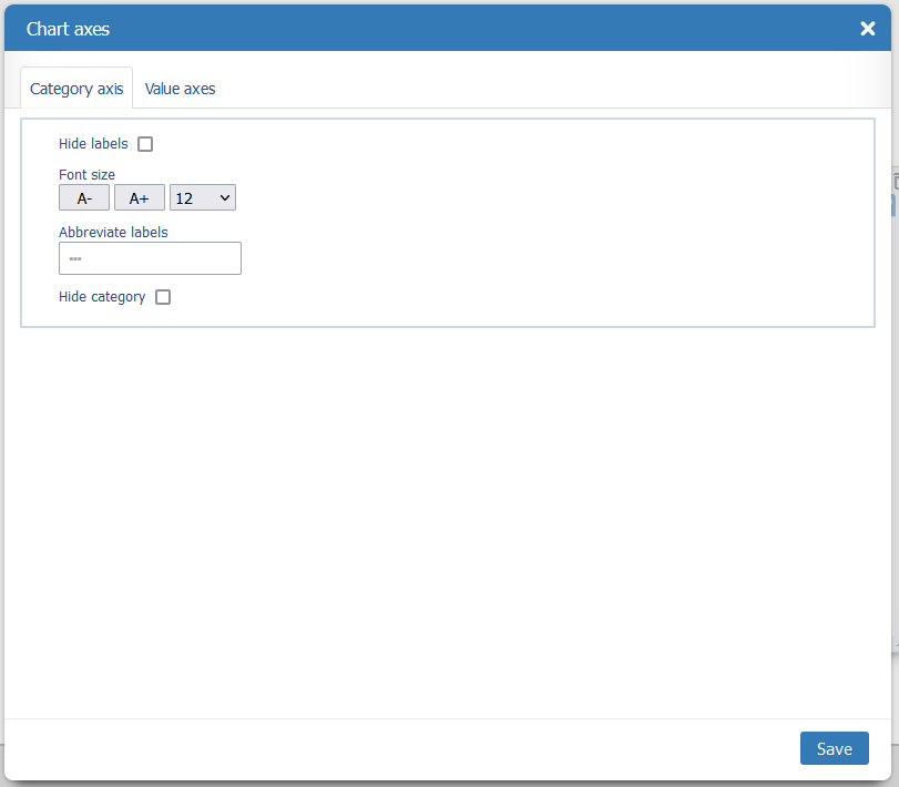
Category Axis
The options here are:
Value Axes
On the Value Axes there are some graphics that support only one value axis (#Simple Value Axis) and other that support one ore more value axis (#Multiple Value Axis)
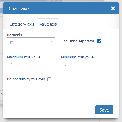
Simple Value Axis
Graphics that support only one value axis
The options here are:
Multiple Value Axis
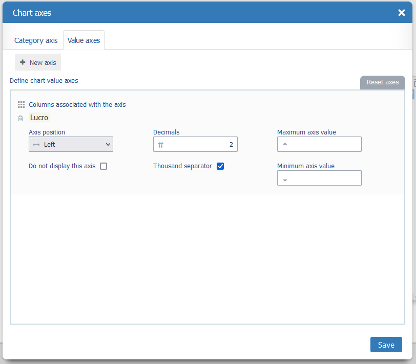
We support graphics that can have one ore more Value Axes, so you can create complex graphics, as you can see bellow.

The use wants do compare Cost and %Profit, but, as the values have a huge difference, using one axis (left graphic) results in a bad view, but with tow axes (right graphic) you can see the variations clearly.
So you can:
- Add more axes to the graphic, using the New Axis button
- Remove the Axis (trash icon)
- Associate the values the each axis
- Choose the Axis Position (on the Left or Right)
- Ordene the Axis order (by dragging the Axis card up and down)
The options for each axis are:


