Difference between revisions of "Combo (Filter)"
(Marked this version for translation) |
|||
| (17 intermediate revisions by 2 users not shown) | |||
| Line 1: | Line 1: | ||
| + | <languages/> | ||
| + | |||
| + | |||
<translate> | <translate> | ||
<!--T:1--> | <!--T:1--> | ||
| + | [[File:mainmenu5.png]] | ||
'''Watch a [[Combo (Filter) Tutorial|video tutorial]] about the combo object'''. | '''Watch a [[Combo (Filter) Tutorial|video tutorial]] about the combo object'''. | ||
<!--T:2--> | <!--T:2--> | ||
| − | Implements a dynamic combo list that allows to filtering objects data content in execution time according to selection. | + | Implements a dynamic combo list that allows to filtering objects data content in execution time according to selection. Supports content search. |
| + | |||
| + | |||
| + | <!--T:29--> | ||
| + | Filters and components (tables, charts, gauges, etc ...) are automatically connected when [[Adding an Object|added to the dashboard]]. | ||
| + | |||
| + | |||
| + | <!--T:30--> | ||
| + | To inhibit automatic connection of filters and components turn off the option in the settings. | ||
| + | |||
| + | |||
| + | <!--T:36--> | ||
| + | By default, arrows indicating the connections between components and filters are displayed only when the component is selected. In this case, the connections of this component are displayed. If you always want to display the indicative setar, just enable the ''Show arrows'' option in the design settings. | ||
| + | |||
| + | <!--T:31--> | ||
| + | [[File:Enable auto filter en-US.png|link]] | ||
| − | |||
| − | |||
| − | <!--T: | + | <!--T:32--> |
| − | + | To connect the Combo (Filter) manually with the components: | |
<!--T:5--> | <!--T:5--> | ||
| Line 47: | Line 64: | ||
* Greater than or equal to (≥) | * Greater than or equal to (≥) | ||
| + | |||
| + | <!--T:38--> | ||
| + | You can set a Initial content for Text Filters. If the content dosn't match no data will be retrieve. | ||
| + | |||
| + | <!--T:39--> | ||
| + | [[File:Initial_content_en-US.PNG]] | ||
| + | |||
| + | |||
| + | <!--T:37--> | ||
| + | Text Combo filters support multiple selections. [[Combo_Filter_Selection|See how]] | ||
| Line 57: | Line 84: | ||
<!--T:15--> | <!--T:15--> | ||
In this example, the Combo (Filter) object is connected to the two data objects (table and chart), making both show the data only for the selected value: ''PIZZA''. | In this example, the Combo (Filter) object is connected to the two data objects (table and chart), making both show the data only for the selected value: ''PIZZA''. | ||
| + | |||
| + | |||
| + | <!--T:33--> | ||
| + | Filters can also be connected hierarchically providing filtering of the contents of the next filter(s). | ||
| + | |||
| + | <!--T:34--> | ||
| + | [[File:Filter hierarchical.PNG|link=]] | ||
| + | |||
| + | |||
| + | <!--T:35--> | ||
| + | Both forms are allowed simultaneously. | ||
| Line 78: | Line 116: | ||
<!--T:27--> | <!--T:27--> | ||
* '''Layout Properties''': | * '''Layout Properties''': | ||
| − | ** [[Hide Border]] | + | ** [[Hide Border|Show Border]] |
** [[Border color|Border Color]] | ** [[Border color|Border Color]] | ||
** [[Background color|Background Color]] | ** [[Background color|Background Color]] | ||
| Line 92: | Line 130: | ||
<!--T:28--> | <!--T:28--> | ||
* '''Column Properties''': | * '''Column Properties''': | ||
| − | ** [[Column name | + | ** [[Selected column]] |
| + | ** [[Column name]] | ||
** [[Data type|Data Type]] | ** [[Data type|Data Type]] | ||
** [[Mask]] | ** [[Mask]] | ||
</translate> | </translate> | ||
Latest revision as of 02:03, 5 October 2022
 Watch a video tutorial about the combo object.
Implements a dynamic combo list that allows to filtering objects data content in execution time according to selection. Supports content search.
Filters and components (tables, charts, gauges, etc ...) are automatically connected when added to the dashboard.
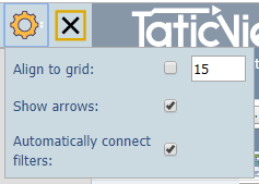
To inhibit automatic connection of filters and components turn off the option in the settings.
By default, arrows indicating the connections between components and filters are displayed only when the component is selected. In this case, the connections of this component are displayed. If you always want to display the indicative setar, just enable the Show arrows option in the design settings.
To connect the Combo (Filter) manually with the components:
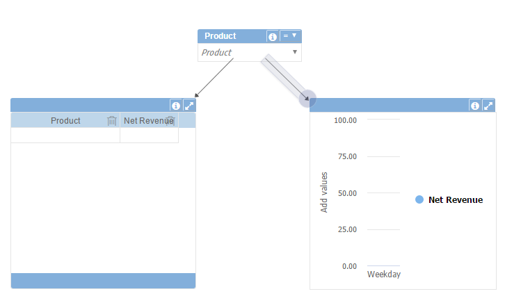
- Select the Combo (Filter) object and click the arrow icon (top right corner):
- Drag the arrow over the desired object and click it:
- An arrow will be shown connecting the Combo (Filter) to the data object.
You can connect the same Combo (Filter) to multiple data objects, allowing to filter all connected objects with the same data and at the same time.
To delete a connection click on the arrow and select the Remove Object(s) on the top bar or press the delete key.
You can also select the Combo (Filter) operation by clicking the drop-down arrow next to the combo title. You can select between:
- Equal (=)
- Different (≠)
- Less than (<)
- Greater than (>)
- Less than or equal to (≤)
- Greater than or equal to (≥)
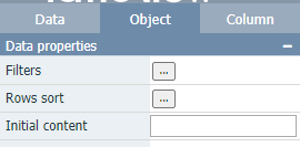
You can set a Initial content for Text Filters. If the content dosn't match no data will be retrieve.
Text Combo filters support multiple selections. See how
Example
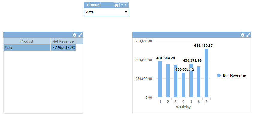
In this example, the Combo (Filter) object is connected to the two data objects (table and chart), making both show the data only for the selected value: PIZZA.
Filters can also be connected hierarchically providing filtering of the contents of the next filter(s).
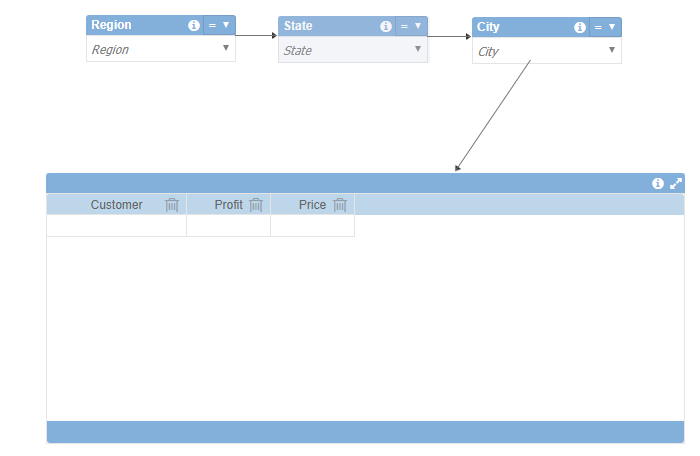
Both forms are allowed simultaneously.
See below all available properties for this object:
- Data Properties:
- Title Bar Properties:
- Layout Properties:
- Column Properties:
