Difference between revisions of "Execute a Dashboard/en"
(Importing a new version from external source) |
(Updating to match new version of source page) |
||
| (12 intermediate revisions by the same user not shown) | |||
| Line 2: | Line 2: | ||
| − | + | <div class="index-right">__TOC__</div> | |
| + | To run a dashboard click on it in the [[Main Page Overview#Dashboards|Dashboards list]], from the main screen. | ||
| + | |||
| + | The same dashboard is not allowed to be run by the same user in two browser tabs. If this happens the first run will be terminated. | ||
The resolution of the dashboard in run time was previously defined by the [[Dashboard dimensions]] property. Because of this the dashboard may be not fit perfectly on your device. | The resolution of the dashboard in run time was previously defined by the [[Dashboard dimensions]] property. Because of this the dashboard may be not fit perfectly on your device. | ||
| + | While a panel is running, the top bar with some options/informations will be displayed. | ||
| − | + | [[File:Dashbord top bar.PNG|link=]] | |
| + | The options are: | ||
| − | + | * Dashboard name | |
| + | * Date and time of last data update | ||
| + | * '''Clear Filters''' button: reset all Combo filters and drildown's settings. | ||
| + | * '''Print''' button: Generates a PDF file with the current image of the panel, thus allowing it to be printed as well as emailed, etc. | ||
| + | ** Clicking Print displays a screen to choose the action to be performed (Download or Open). | ||
| + | * '''Edit dashboard''' button: Available when you own the dashboard or have write permission on a dashboard that has been shared with you. Clicking this option will display the design screen for you to make modifications to the dashboar. | ||
| + | * '''Share''' button: If dashboard was created by you, you can share it with others by using this option. Remember that to use [[Share dashboards|dashboard sharing]] you need to have this feature (Shared users) contracted in your [[Subscriptions|subscription]]. | ||
| + | * '''Exit''' button: To stop a dashboard from running and return to the main screen or dashboard design | ||
| − | + | To view one object in full screen, click the maximize [[File:Maximizar.png|link=]] icon. To exit full screen, click the restore [[File:Minimizar.png|link=]] icon. | |
| + | In graphics, you can enable and disable charts series by clicking on its labels. | ||
Some objects, like [[Table]] and [[Cross Table]], have a footer that shows rows information, navigation through pages commands and number of rows per page setting: | Some objects, like [[Table]] and [[Cross Table]], have a footer that shows rows information, navigation through pages commands and number of rows per page setting: | ||
| − | [[File:Executando um Dashboard 1+en-US.PNG]]. | + | [[File:Executando um Dashboard 1+en-US.PNG|link=]]. |
| + | |||
| + | If the dashboard you are executing has [[Combo (Filter)]] objects you can interact with those to dynamically change the dashboard's data. | ||
| + | |||
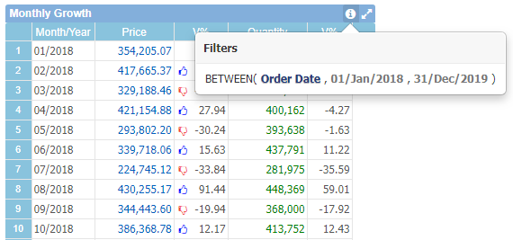
| + | To view objects applied filters, select the [[File:Filtros.png|link=]] icon: | ||
| + | |||
| + | [[File:Executando um Dashboard 2+en-US.png|link=]] | ||
| + | |||
| + | |||
| + | === Considerations for Mobile Devices === | ||
| + | |||
| + | When a dashboard is run through a smartphone or tablet (the latter, depending on the screen resolution) some features are adopted by default. | ||
| + | |||
| + | In this type of execution only data components (tables, graphs, gauge ) will be available. | ||
| + | |||
| + | In addition, to further enhance the application's user experience, each component is displayed at once on the screen (provided the dashboard has no overlapping objects, more details below). Allowing the user to scroll between components configured on the dashboard. | ||
| + | |||
| + | Because a dashboard can contain one or many components, depending on its dimensions, viewing on mobile devices would be compromised. With TaticView's default behavior in this case, keeping one component visible at a time makes it much easier to see the information that each component displays. | ||
| + | |||
| + | However, the user can still choose to view the dashboard with the desktop layout, which is probably the original dashboard layout. To do this, simply access the dashboard options and click on ''Desktop view''. | ||
| + | |||
| + | When a dashboard has the ''Combo (Filter)'' component added, on mobile devices these components will be accessible via the button located in the lower right corner of the screen. This way, the user can easily change the selections applied to the components during the execution of the dashboard. | ||
| + | To change the visible component on the screen, use the arrows that will be available on the sides of the dashboard. | ||
| − | + | <span id="OverlappedComponents"> | |
| + | An important note about running dashboards on mobile devices is that if the dashboard has overlapping components, the dashboard preview will be in the desktop pattern. This is because the mobile view displays one component at a time, and sometimes the developer overlaps components to display information that only makes sense in this way. Therefore, in mobile viewing would not make sense. Therefore, if the dashboard has overlapping components, the default view will be the desktop. | ||
| + | </span> | ||
| + | [[File:Mobile dashboard execution en-US.png|link=]] | ||
| − | |||
| − | [[ | + | [[Mobile Development|Here are]] best practices tips for developing your dashboards to run on smartphones and/or tablets. |
Latest revision as of 11:36, 10 August 2020
Contents
To run a dashboard click on it in the Dashboards list, from the main screen.
The same dashboard is not allowed to be run by the same user in two browser tabs. If this happens the first run will be terminated.
The resolution of the dashboard in run time was previously defined by the Dashboard dimensions property. Because of this the dashboard may be not fit perfectly on your device.
While a panel is running, the top bar with some options/informations will be displayed.

The options are:
- Dashboard name
- Date and time of last data update
- Clear Filters button: reset all Combo filters and drildown's settings.
- Print button: Generates a PDF file with the current image of the panel, thus allowing it to be printed as well as emailed, etc.
- Clicking Print displays a screen to choose the action to be performed (Download or Open).
- Edit dashboard button: Available when you own the dashboard or have write permission on a dashboard that has been shared with you. Clicking this option will display the design screen for you to make modifications to the dashboar.
- Share button: If dashboard was created by you, you can share it with others by using this option. Remember that to use dashboard sharing you need to have this feature (Shared users) contracted in your subscription.
- Exit button: To stop a dashboard from running and return to the main screen or dashboard design
To view one object in full screen, click the maximize ![]() icon. To exit full screen, click the restore
icon. To exit full screen, click the restore ![]() icon.
icon.
In graphics, you can enable and disable charts series by clicking on its labels.
Some objects, like Table and Cross Table, have a footer that shows rows information, navigation through pages commands and number of rows per page setting:
.
If the dashboard you are executing has Combo (Filter) objects you can interact with those to dynamically change the dashboard's data.
To view objects applied filters, select the ![]() icon:
icon:

Considerations for Mobile Devices
When a dashboard is run through a smartphone or tablet (the latter, depending on the screen resolution) some features are adopted by default.
In this type of execution only data components (tables, graphs, gauge ) will be available.
In addition, to further enhance the application's user experience, each component is displayed at once on the screen (provided the dashboard has no overlapping objects, more details below). Allowing the user to scroll between components configured on the dashboard.
Because a dashboard can contain one or many components, depending on its dimensions, viewing on mobile devices would be compromised. With TaticView's default behavior in this case, keeping one component visible at a time makes it much easier to see the information that each component displays.
However, the user can still choose to view the dashboard with the desktop layout, which is probably the original dashboard layout. To do this, simply access the dashboard options and click on Desktop view.
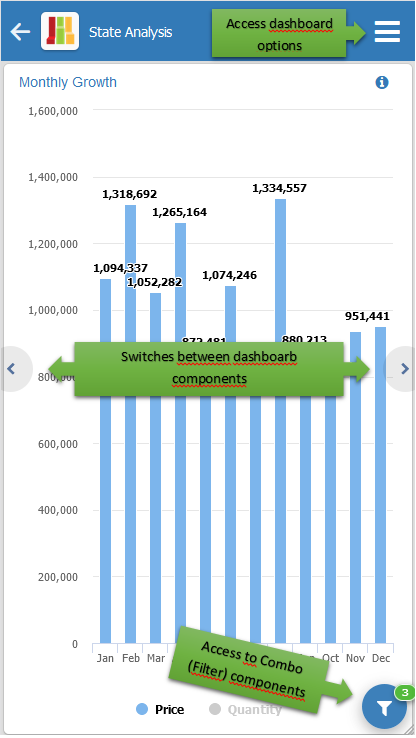
When a dashboard has the Combo (Filter) component added, on mobile devices these components will be accessible via the button located in the lower right corner of the screen. This way, the user can easily change the selections applied to the components during the execution of the dashboard.
To change the visible component on the screen, use the arrows that will be available on the sides of the dashboard.
An important note about running dashboards on mobile devices is that if the dashboard has overlapping components, the dashboard preview will be in the desktop pattern. This is because the mobile view displays one component at a time, and sometimes the developer overlaps components to display information that only makes sense in this way. Therefore, in mobile viewing would not make sense. Therefore, if the dashboard has overlapping components, the default view will be the desktop.

Here are best practices tips for developing your dashboards to run on smartphones and/or tablets.